Shopify bulk order form design affects how B2B buyers place orders. It affects speed. It affects accuracy. And it affects whether buyers return. Dermalogica’s Shopify B2B portal shows that after improving bulk ordering, conversion rates increased by 23 percent. Reorder frequency tripled. When ordering feels easy, buyers stay. When it feels slow or confusing, they leave.
Most B2B buyers are not browsing. They arrive knowing what they need. They want to place the order and move on. Layout plays a big role here. A clear B2B order form layout reduces mistakes and saves time. It also builds trust. To get this right, merchants need to understand matrix, grid, and list layouts. And this is why you need this guide to help you get it right.
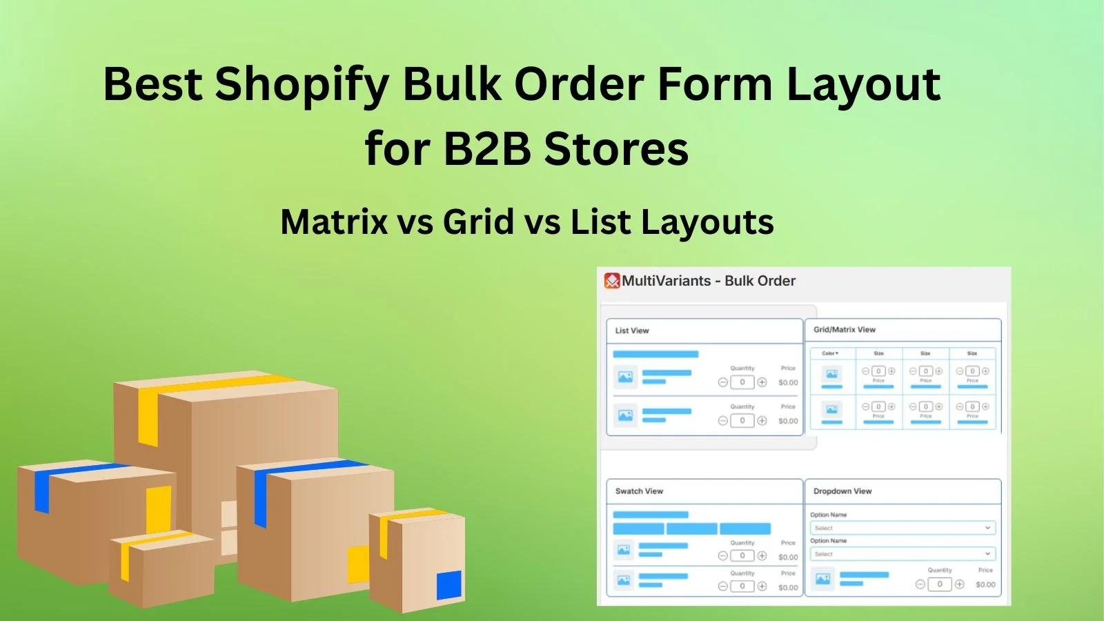
- Matrix layouts are fastest for repeat B2B orders with size and color variants.
- Grid layouts work best when images help buyers pick variants.
- List layouts are simplest for small catalogs and mobile ordering.
- The best layout depends on variant count, order size, and buyer habits.
- Apps like MultiVariants support matrix, grid, and list layouts without custom development.
Table of Contents
What Is a Shopify Bulk Order Form
A bulk order form lets buyers order many variants from one page. In a Shopify wholesale order form, buyers enter quantities directly. They do not click through each variant. Everything goes into the cart at once. The process stays simple.
Think about a buyer ordering uniforms for a team. They need many sizes and colors. Without a bulk order form, that order takes time. With one, it takes minutes. All quantities are entered in one place.
A Shopify B2B order form focuses on speed and clarity. It removes extra steps. It keeps variants, quantities, and availability visible. This helps buyers avoid mistakes that happen when switching between product pages.
Many wholesale buyers already use spreadsheets or order sheets. A structured form feels familiar. That familiarity lowers friction. It makes ordering feel safe and predictable.
In the next section, we will see why these layouts are important in the wholesale industry. Let us see why Shopify merchants like yourself need them for your store.
Why B2B Order Form Layout Matters for Wholesale Buying
A B2B order form layout controls how buyers interact with products inside a Shopify bulk order form. Wholesale buyers place large orders. Often the same order again and again. Small layout problems add up fast.
Picture a buyer choosing the wrong size because the options were too close together. That one mistake can lead to returns and delays. It can also trigger support emails. A clear layout helps prevent this before checkout.
The best layout for wholesale ordering in Shopify stores matches how buyers think. Some buyers like tables. Others prefer grouped visuals. When the layout feels unfamiliar, ordering slows down.
Layout also matters after the order is placed. Many companies review orders before approval. A clean layout makes that review easier.
Matrix Layout Explained for Product Matrix Order Form
How a Variant Matrix Works in Shopify Bulk Ordering
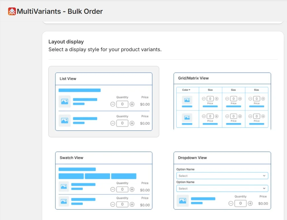
A product matrix order form shows variants in rows and columns. One option runs across. Another run-down. Buyers enter quantities where they meet.
For example, a clothing wholesaler selling five sizes and six colors can show everything in one table. Buyers scan the grid and enter numbers. No page changes. No confusion.
The variant matrix Shopify merchants use works well for large catalogs. Buyers stay on one screen. They do not lose context. This saves time.
Matrix layouts also feel familiar. They look like inventory sheets. Buyers understand them quickly.
When a Matrix Layout Is the Best Choice
Matrix layouts work best when products have clear options. Usually two or three. They suit repeat buyers who already know the products.
A distributor placing the same order every month can finish in minutes with a matrix layout. That speed matters.
For stores with large wholesale clients, matrix layouts reduce errors. Buyers see everything before submitting. Fewer mistakes. Fewer returns.
Limitations of Matrix Order Forms
Matrix layouts can feel tight on small screens. Mobile users may need to scroll sideways. Not everyone likes that.
If products have too many options, the product matrix order form can feel crowded. In those cases, merchants may need to limit options or use another layout. It depends on the product and the buyer.
Grid Layout Explained for Shopify Bulk Ordering
How Grid Layouts Handle Multiple Variants
Grid layouts show variants as cards or tiles. Each card has a name, price, and quantity field. This Shopify bulk ordering layout mixes structure with visuals.
Think of a food wholesaler selling different flavors. Each flavor appears as a card. Buyers choose what they need and enter quantities.
Grids are easy to scan. Buyers spot what they want quickly. This works well when images help with selection.
Best Use Cases for Grid Layouts
Grid layouts work best when there are not too many variants. Images help buyers decide. The layout also works well on mobile screens.
Merchants selling gift sets or packaged products often choose grids. The layout feels simple but still supports bulk orders.
Grid Layout Trade-offs in B2B Ordering
Grids can slow things down for large orders. More scrolling is needed.
For repeat buyers placing the same order often, grids may add extra steps. Merchants should think about how often buyers reorder.
List Layout Explained: Grid vs List Layout Shopify
How List Layouts Work in a Shopify B2B Order Form
List layouts show variants in a vertical list. One item per row. Quantity fields sit beside each option. The grid vs list layout Shopify choice often comes down to simplicity.
A store selling spare parts with limited options is a good example. Each size appears in a list. Buyers enter quantities and move on.
List layouts are easy to understand. Buyers read from top to bottom.
When List Layouts Make Sense
List layouts work well for small catalogs. They also work well on mobile.
For new wholesale buyers, lists feel less intimidating. They help buyers get comfortable with bulk ordering.
Where List Layouts Fall Short for Bulk Orders
As catalogs grow, lists get long. Scrolling takes time. Large orders feel slower.
For advanced wholesale buyers, list layouts often fall short. Speed becomes the priority.
Matrix vs Grid vs List: Choosing the Best Shopify Bulk Order Form Layout
There is no perfect layout. The right choice depends on products, order size, and buyer habits. A Shopify bulk order form should feel natural to the buyer using it.
The best layout for wholesale ordering that Shopify merchants choose often comes from testing. Matrix layouts focus on speed. Grid layouts balance visuals and structure. List layouts keep things simple.
Many merchants start with one layout and change later. Wholesale programs grow. Layouts should grow with them.
How Merchants Handle These Layouts in Real Shopify Stores
Shopify themes offer limited support for advanced wholesale ordering. Large variant catalogs are hard to show clearly inside a Shopify bulk order form.
A Shopify wholesale order form layout often needs more flexibility. Merchants want control over layout and behavior. They want the ordering process to feel smooth for buyers.
Supporting Advanced B2B Order Form Layouts Without Custom Development
Managing a flexible B2B order form layout without custom code can be difficult. Some Shopify bulk ordering apps help merchants support matrix, grid, or list layouts based on their needs.
MultiVariants is one example. It keeps variant selection structured and clean. Merchants can adjust layouts as their catalog grows. This helps stores scale without rebuilding their ordering flow. It is especially helpful now during Christmas bulk orders.
Common Mistakes Merchants Make When Choosing a Bulk Order Form Layout
There are two mistakes that merchants often make. Try to avoid them for a smooth bulk order selling process.
One common mistake is choosing a layout only because it looks good. A Shopify bulk order form layout needs to work first. Design comes later.
Another mistake is ignoring repeat buyers. Wholesale customers care about speed and consistency. Layouts should make reordering easy. Testing with real buyers helps avoid issues later.
Final Thoughts
A Shopify bulk order form affects how buyers feel about ordering. It affects speed. It affects accuracy. It affects repeat purchases. Matrix, grid, and list layouts all have a place. Merchants should review their catalog and adjust it over time.
A Shopify bulk order form app can help you be more in control of your layouts. Choose the right layout and observe the outcome. See how your customers react. Small changes can lead to better results. A clear layout supports long-term B2B growth. We hope you found this article helpful. For more b2b growth tips, check out our other blogs.
FAQs
What is a Shopify bulk order form?
A Shopify bulk order form lets customers order multiple product variants from one page. Buyers enter quantities directly and add all items to the cart at once. This is useful for wholesale and B2B stores.
Why is layout important for B2B bulk ordering?
Layout affects how fast and accurately buyers place orders. A clear layout reduces mistakes and saves time. This matters most for large and repeat orders.
What is a matrix layout in bulk ordering?
A matrix layout shows variants in rows and columns, such as size and color. Buyers can see all combinations at once and enter quantities easily. It works well for large variant catalogs.
When should I use a grid layout for B2B orders?
Grid layouts work well when products have images and a moderate number of variants. They balance visual clarity and structure and are easier to use on mobile.
Is a list layout suitable for wholesale stores?
List layouts work best for simple products with fewer variants. They are easy to understand and mobile-friendly, but can be slow for large orders.
Which layout is best for high-volume wholesale buyers?
Matrix layouts are usually best for high-volume buyers. They allow fast quantity entry and reduce ordering time.
Can Shopify handle bulk order layouts without apps?
Shopify’s default product pages have limited support for bulk ordering. Advanced layouts often need extra tools to work smoothly.
How do bulk order layouts reduce ordering errors?
They show variants and quantities clearly on one page. Buyers can review everything before checkout. This reduces mistakes caused by switching pages.
Can I use different layouts for different products?
Yes. Many merchants use list layouts for simple products and matrix layouts for complex ones. This gives flexibility as catalogs grow.
How do apps like MultiVariants support bulk ordering?
Apps like MultiVariants help merchants display complex variant options in structured layouts. They improve ordering flow without heavy customization.